Afterglow Candle App
Case Study
PROJECT OVERVIEW
— TOOLS
Figma
Adobe Creative Suite
— TOOLS
UX designer leading the app design from conception to delivery
— RESPONSIBILITIES
> Conducting interviews
> User Journey Mapping
> Ideation & Wireframing
> Prototyping
> Conducting usability studies
> Iterating on designs
— DURATION
Feb – July 2022
The Challenge
Shopping for candles online can be challenging due to the inability to experience scent through a screen. Compounding this issue is the tendency of many candle brands to use abstract, non-descriptive names for their products, making it a time-consuming task to find a candle that suits your preferences.
Afterglow, an eCommerce candle retailer, aims to simplify the online shopping experience by providing a platform that helps homebodies, remote workers, and candle enthusiasts discover and enjoy a diverse range of delightful scents in their homes, eliminating the need to physically smell the candles before purchasing.
The Objective
Design a user-friendly, aesthetically pleasing app interface and checkout flow for Afterglow that allows users to easily quickly navigate through and order a variety of candle scents.
USER RESEARCH
I interviewed 4 individuals and created empathy maps to understand the users I’m designing for and their needs. A primary user group identified through research was pet owners who work from home and struggle to keep their environment feeling fresh and welcoming.
IDEATION
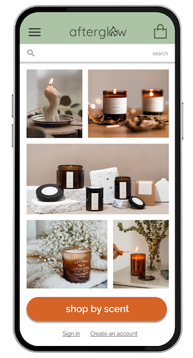
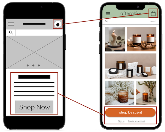
I sketched paper wireframes to identify the best way to address user pain points. For the home screen, I prioritized an inviting design with a clear call to action leading into a quick and easy categorical approach to navigation to help users save time. I then starred the design elements that I wanted to include in my first iteration.
Paper wireframes — stars indicate a design elements I wanted to include in the first iteration.
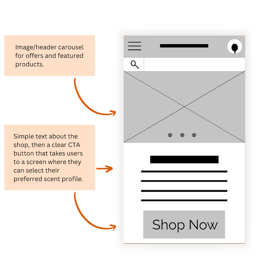
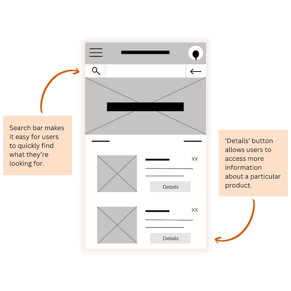
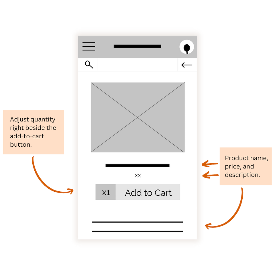
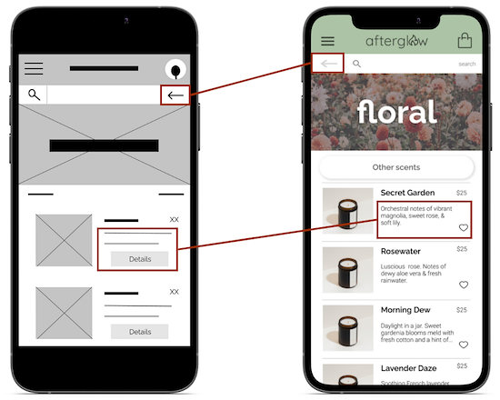
FIRST ITERATION
Moving from paper to digital wireframes made it easy to understand how the redesign could help address user pain points and improve the user experience. Prioritizing useful button locations and visual element placement on the home page was a key part of my strategy.
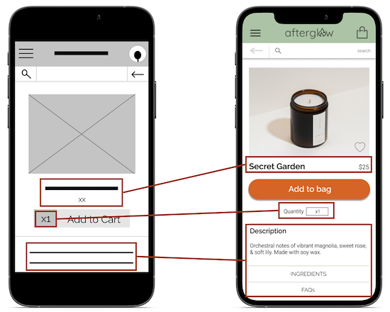
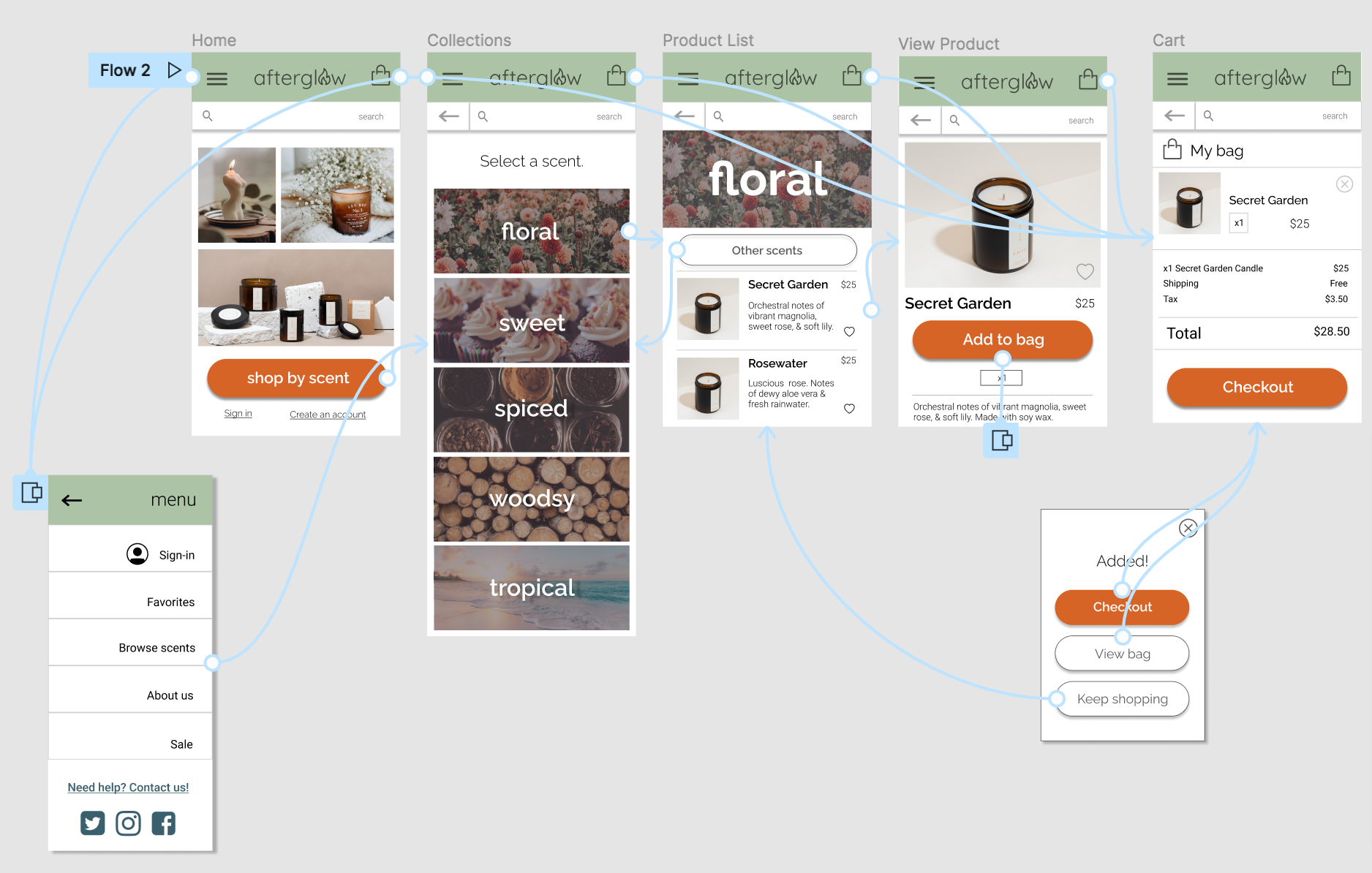
INITIAL PROTOTYPE
Using the completed set of digital wireframes, I created a low-fidelity prototype of the search and checkout process to be used in a usability study.

USABILITY STUDY
Participants
4 people
Location
- US, Remote
Length
- 5-10 minutes
Contact
email@domain.com
000-000-000
Purpose
To see how many users could complete the flow and collect feedback on the design
Study Type
- Unmoderated usability study
Results
- 4/4 user completed full search and checkout flow
Contact
email@domain.com
000-000-000
FINDINGS
Navigation
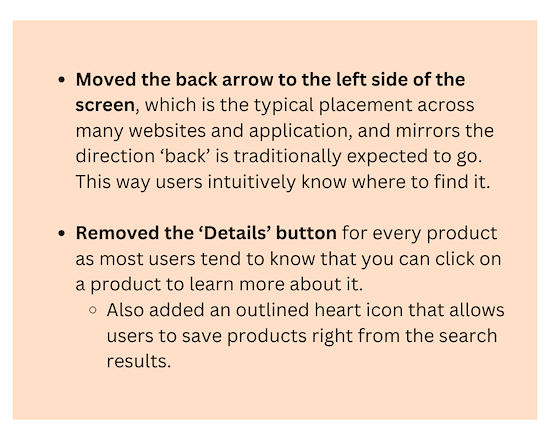
Back button moved around, causing confusion.
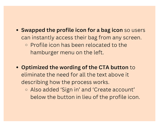
Cart
- Not easy to navigate to cart from home screen. Profile icon in the upper-right corner may be better served as a cart icon.
Favorites
- No way to bookmark/save favorite scents for later if users don’t want to purchase immediately.
Contact
email@domain.com
000-000-000
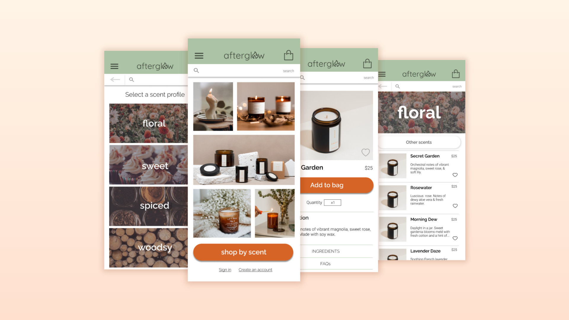
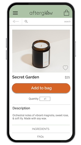
MOCKUPS
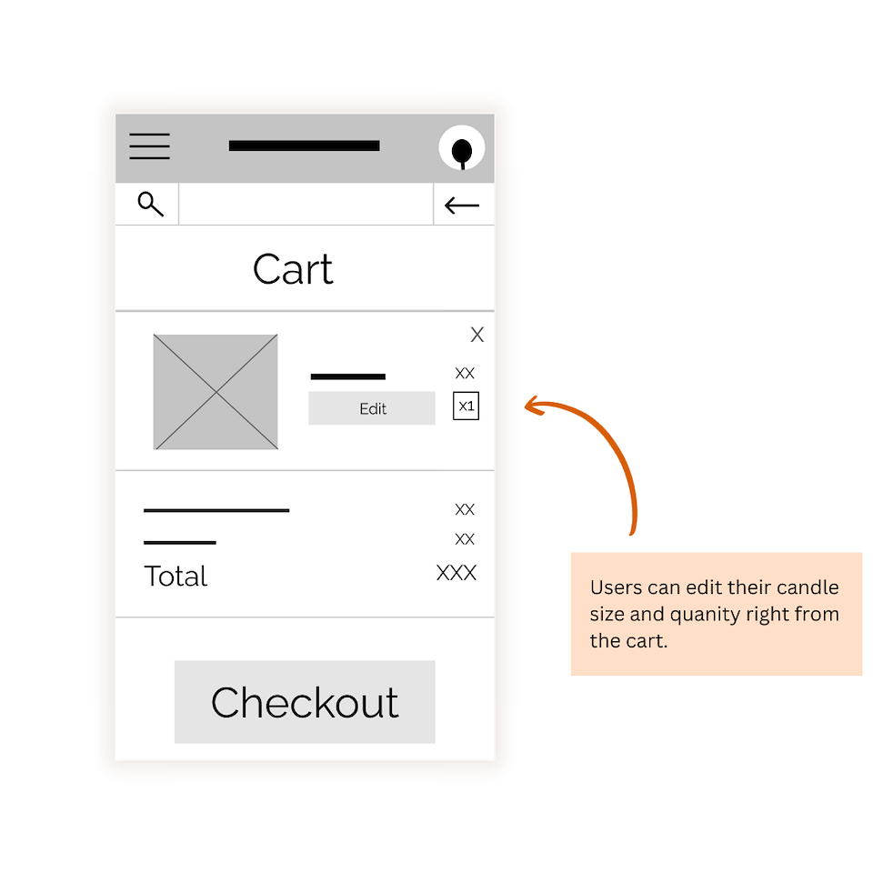
Early designs allowed for some smooth navigation, but after the usability studies, I added additional options to favorite candles for later. I also revised the design so users can access their cart from any screen, and kept the back button in the same place.
KEY DESIGN DECISIONS FROM USABILITY STUDY FINDINGS
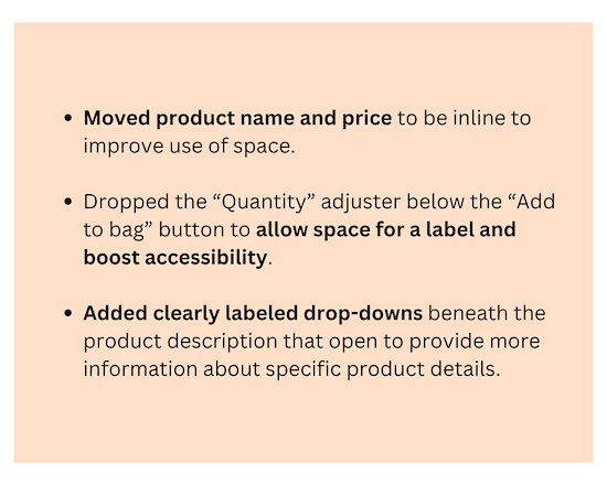
UPDATED PROTOTYPE
The high-fidelity prototype followed the same user flow as the low-fidelity prototype, including any design changes made after receiving feedback on the lo-fi designs.
ACCESSIBILITY CONSIDERATIONS
#1
Used icons and common nav placement to make navigation smoother and more intuitive.
#2
- Included alt text for images and clear labels for visually impaired users using screen readers.
#3
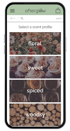
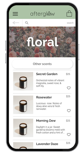
- Used detailed imagery for scent categories to help users better understand the available scents.
Contact
email@domain.com
000-000-000
TAKEAWAYS
IMPACT: The app makes users feel like Afterglow really thinks about how to meet their needs. Quote from peer feedback: “This app is so aesthetically pleasing! I would definitely order from this store."
LESSONS LEARNED: While designing the Afterglow app, I learned that the first ideas for the app are only the beginning of the process. Usability studies and peer feedback influenced each iteration of the app design.
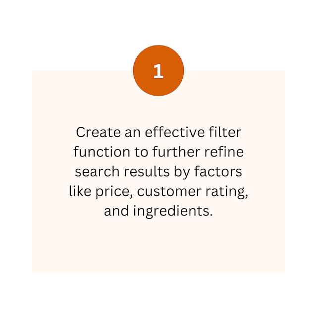
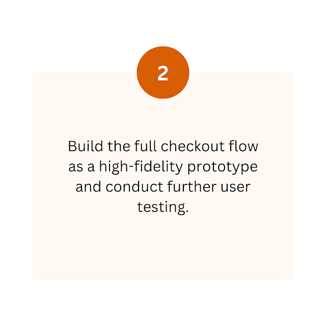
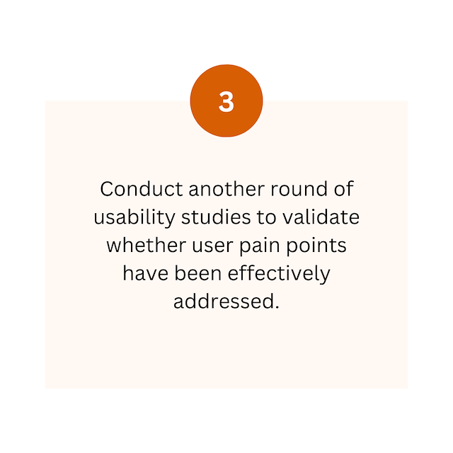
NEXT STEPS

Thank’s for checking out my work on Afterglow!
Want to work together?
Get in touch anytime via LinkedIn or by emailing me at jenniferwalkerux@gmail.com