Shop Small Search Engine
Case Study
PROJECT OVERVIEW
— TOOLS
Adobe XD
— ROLE
UX designer leading the app and responsive website design from conception to delivery
— RESPONSIBILITIES
Conducting interviews, paper & digital wireframes, prototyping, conducting usability studies, accounting for accessibility, iterating on designs, determining information architecture, and responsive design
— DURATION
July 2022 – August 2022
The Challenge
Available online small business databases have cluttered designs, inefficient systems for browsing through small businesses, are usually just for a single city or state, and do not account for fully virtual small businesses.
Shop Small is a small business finder. The typical user is between 19-35 years old, and most users are college students or early career professionals who prefer to support small businesses. Shop Small’s goal is to make it fun, fast, and easy for all types of users to find small businesses to support (both locally and online).
The Objective
Design a searchable website for finding small businesses to support. It should be user friendly by providing clear navigation, offer highly specific filtration capabilities, and should eventually develop into a hub where small businesses can connect with potential customers by updating their profiles and sending offers directly to anyone who add the business to their Favorites.
USER RESEARCH
I conducted user interviews, which I then turned into empathy maps to better understand the target user and their needs. I discovered that many target users would like to support more small businesses, but have no way of finding a small business for everything they may need. This caused them to most often resort to shopping from large corporations for most items, even when they would prefer to support a smaller company that is more in line with their personal values.You can use this layout block as a little about me blurb or use it on top of projects to and add a description. To edit the copy, just click right in here.
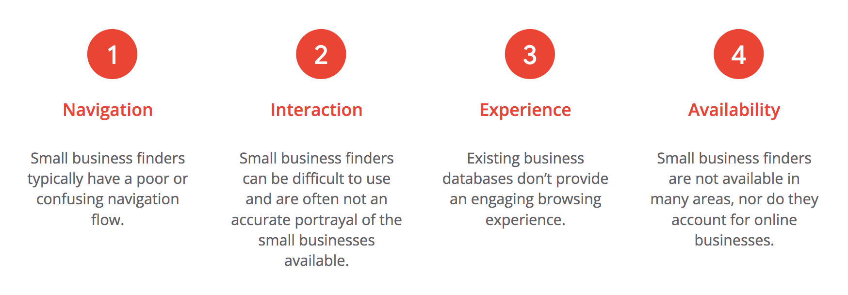
User Pain Points
TARGET USERS
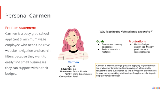
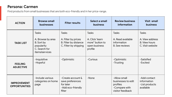
Next, I used my research to create a persona and a user journey map,
IDEATION
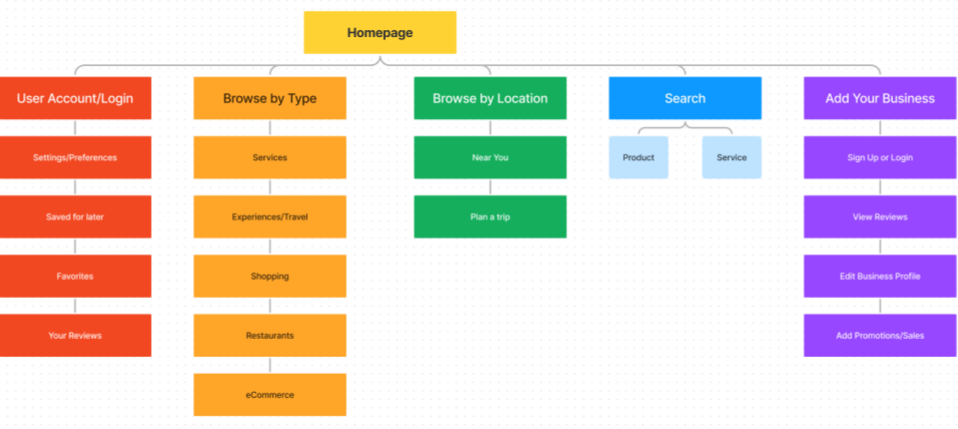
Difficulty with website navigation was a primary pain point for users, so I used that knowledge to create a sitemap. My goal here was to make strategic information architecture decisions that would improve overall website navigation. The structure I chose was designed to make things as straightforward as possible.Difficulty with website navigation was a primary pain point for users, so I used that knowledge to create a sitemap. My goal here was to make strategic information architecture decisions that would improve overall website navigation. The structure I chose was designed to make things as straightforward as possible.
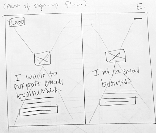
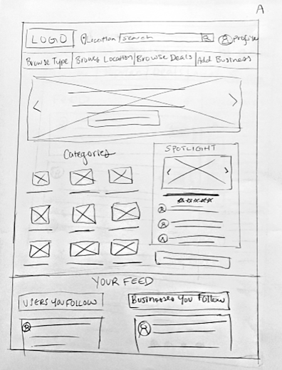
After developing an initial sitemap, I sketched out paper wireframes of various potential approaches I could take to reach a solution, keeping the user pain points about navigation, browsing, and experience in mind.
DIGITAL WIREFRAMES
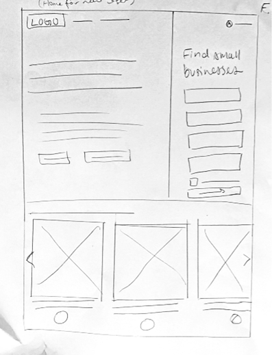
Moving from paper to digital wireframes made it easy to understand how the redesign could help address user pain points and improve the user experience. Prioritizing useful button locations and visual element placement on the home page was a key part of my strategy.
LO-FI PROTOTYPE
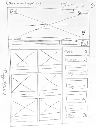
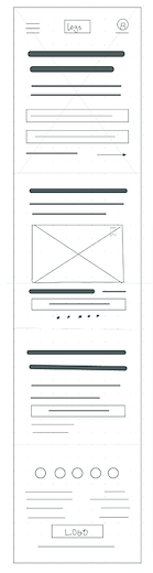
To create a low-fidelity prototype, I connected all of the screens involved in the primary user flow of searching for a business, filtering results, and saving a search result to favorites.At this point, I had received feedback on my designs about things like placement of buttons and page organization. I made sure to listen to their feedback, and I implemented several suggestions in places that addressed user pain points.

USABILITY STUDY
Study Type
Unmoderated usability study
Participants
- 5 participants
Location
- US, remote
Length
20-30 minutes
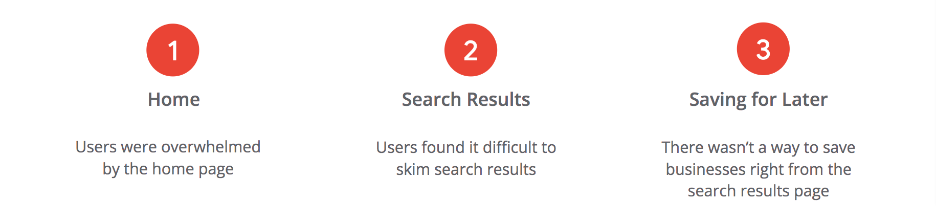
FINDINGS
MOCKUPS
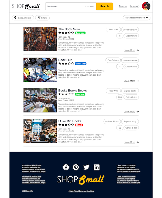
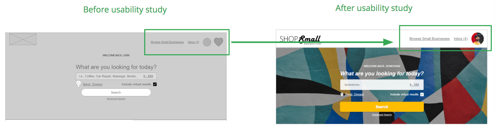
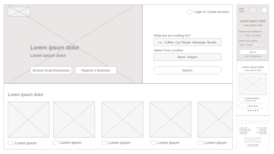
Because there are so many ways to search on the site, I decided to consolidate the navbar links into 3 primary actions.
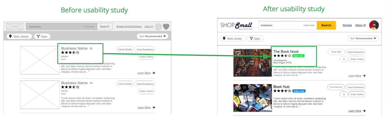
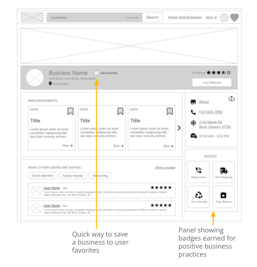
Based on the insights from the usability study, I made it easier for users to find out if a small business is currently open, closed, or online only by adding tags to the search results.
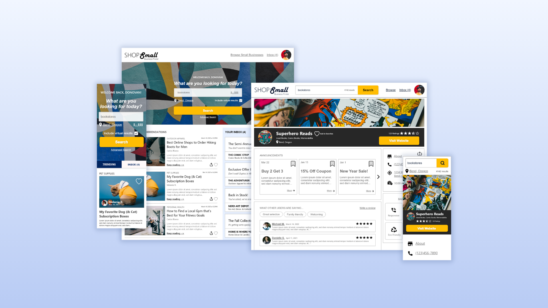
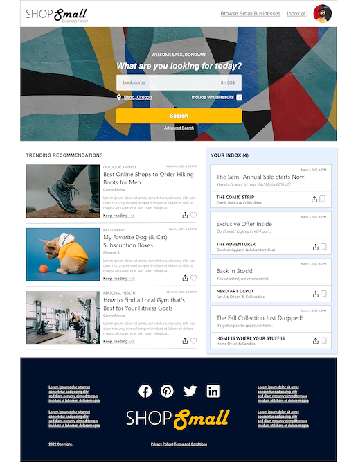
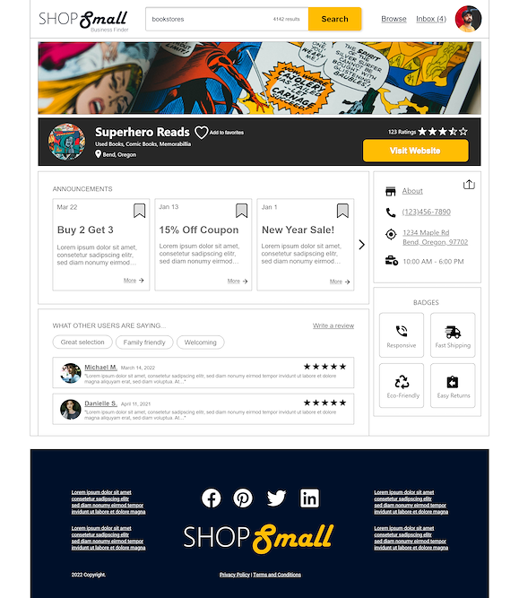
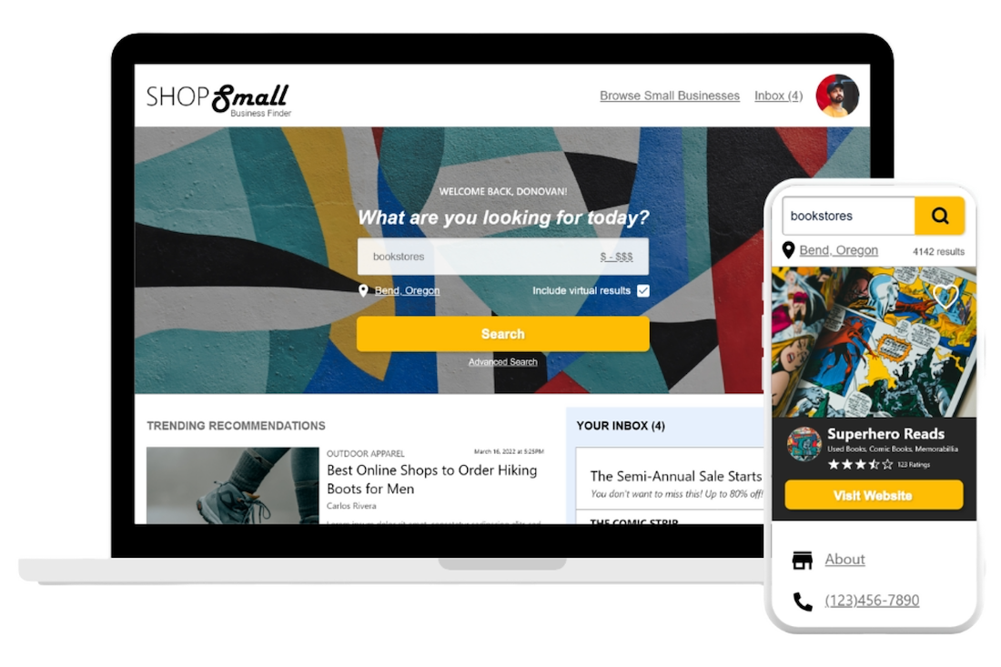
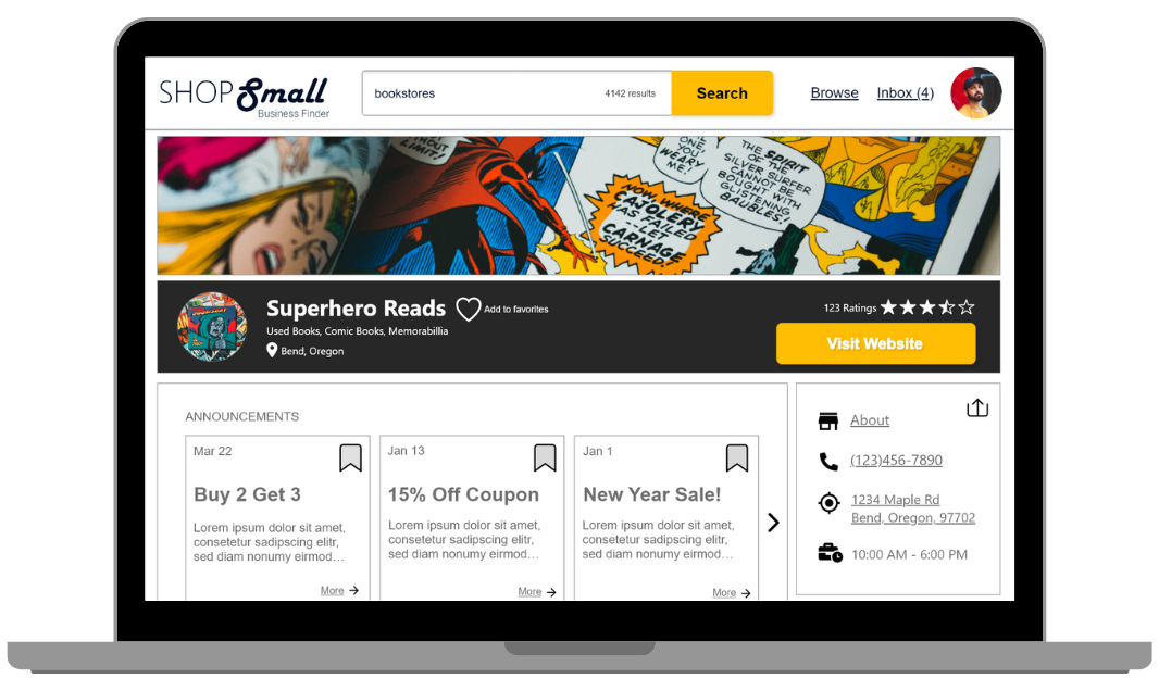
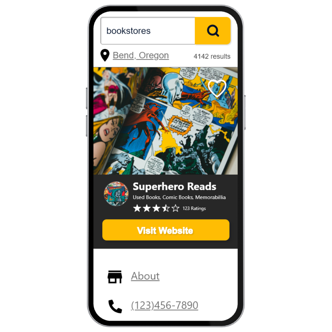
HI-FI PROTOTYPE
The high-fidelity prototype followed the same user flow as the low-fidelity prototype, including any design changes made after receiving feedback on the lo-fi designs.

ACCESSIBILITY CONSIDERATIONS
#1 – I used headings with different sized text for clear visual hierarchy.
#2 – I included landmarks to help users navigate the site, including users who rely on assistive technologies.
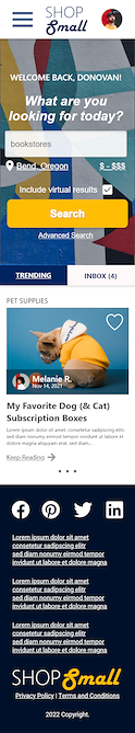
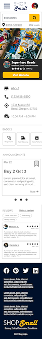
RESPONSIVE DESIGNS
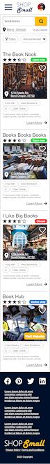
I optimized the designs to be responsive on both mobile and desktop.
TAKEAWAYS
IMPACT: Target users shared that the design was intuitive to navigate through, more engaging with the images, and demonstrated a clear visual hierarchy.
IN RETROSPECT: Even a small design change can have a huge impact on the user experience. The most important takeaway for me is to always focus on the real needs of the user when coming up with design ideas and solutions.
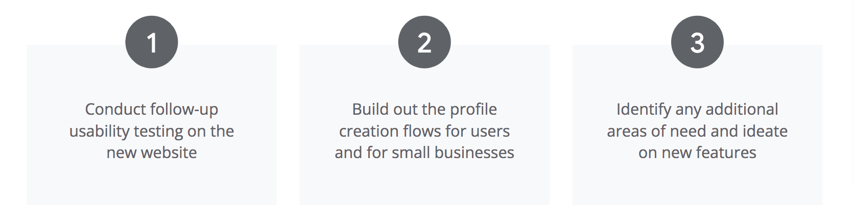
NEXT STEPS

Thank you for reviewing my work on the Shop Small search engine!
Get in touch anytime via LinkedIn or by emailing me at jenniferwalkerux@gmail.com